Each Saturday, #we publish our Chart of the Week. It presents interesting trends and data, usually related to the U.S. labor market.
Yesterday, the U.S. Bureau of Labor Statistics (BLS) released the monthly jobs report for June, 2012. The BLS said private payrolls increased 84,000, while the government lost 4,000 jobs. Economists expected job growth of about 100,000 and the unemployment rate to be unchanged, though many had increased their forecasts based on some recent indicators.
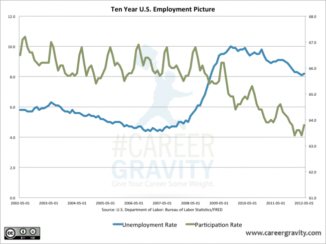
With all of the monthly and weekly data releases that talk about job creation and unemployment, it’s easy for the forrest to be hidden by the trees. This week’s chart shows ten years worth of unemployment rates and labor participation rates. It clearly shows a historic inversion has occurred since the Great Recession.
While the unemployment rate has been slowly drifting down, the overall labor force participation rate has been steadily declining as well. The number of workers actually participating in the work force remains at its lowest level since 1985. Keep this in mind as the economy begins to improve: The unemployment rate will actually increase when people begin to return to the workforce!
During this Presidential campaign season, we’re going to be hearing a lot of numbers thrown around by both sides. Always be sure to keep them in context.


No comments yet.